Client
Mercedes-Benz
Designing a mobile companion app for the MBUX ecosystem, comfort controls for rear-seat passengers, informed by a research study on platform-native versus MBUX-adapted design patterns.
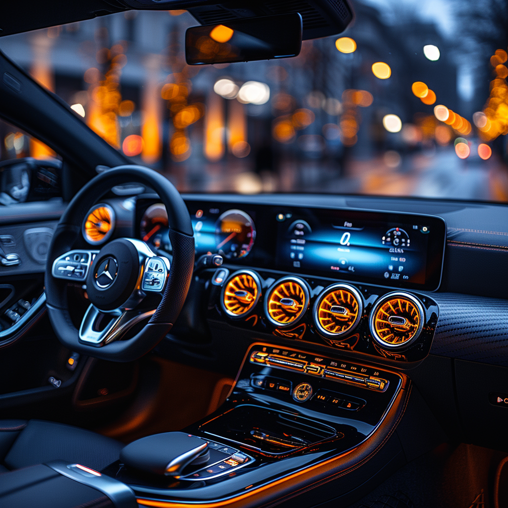
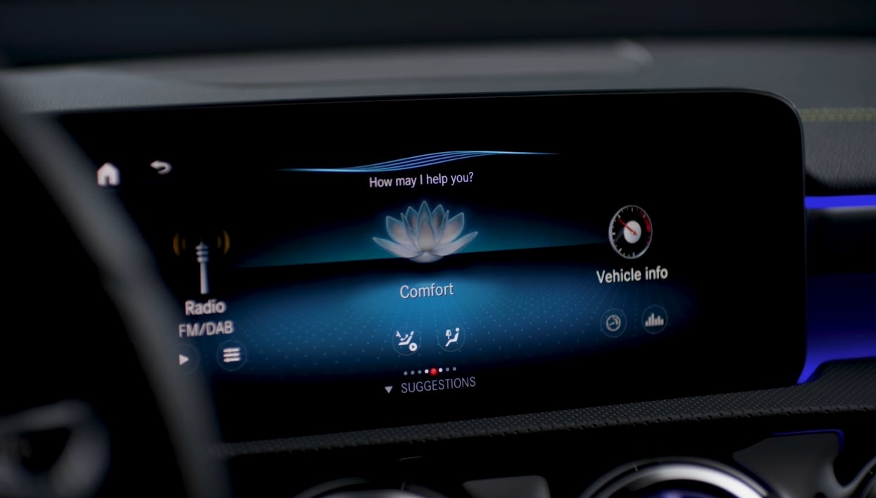
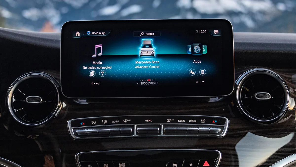
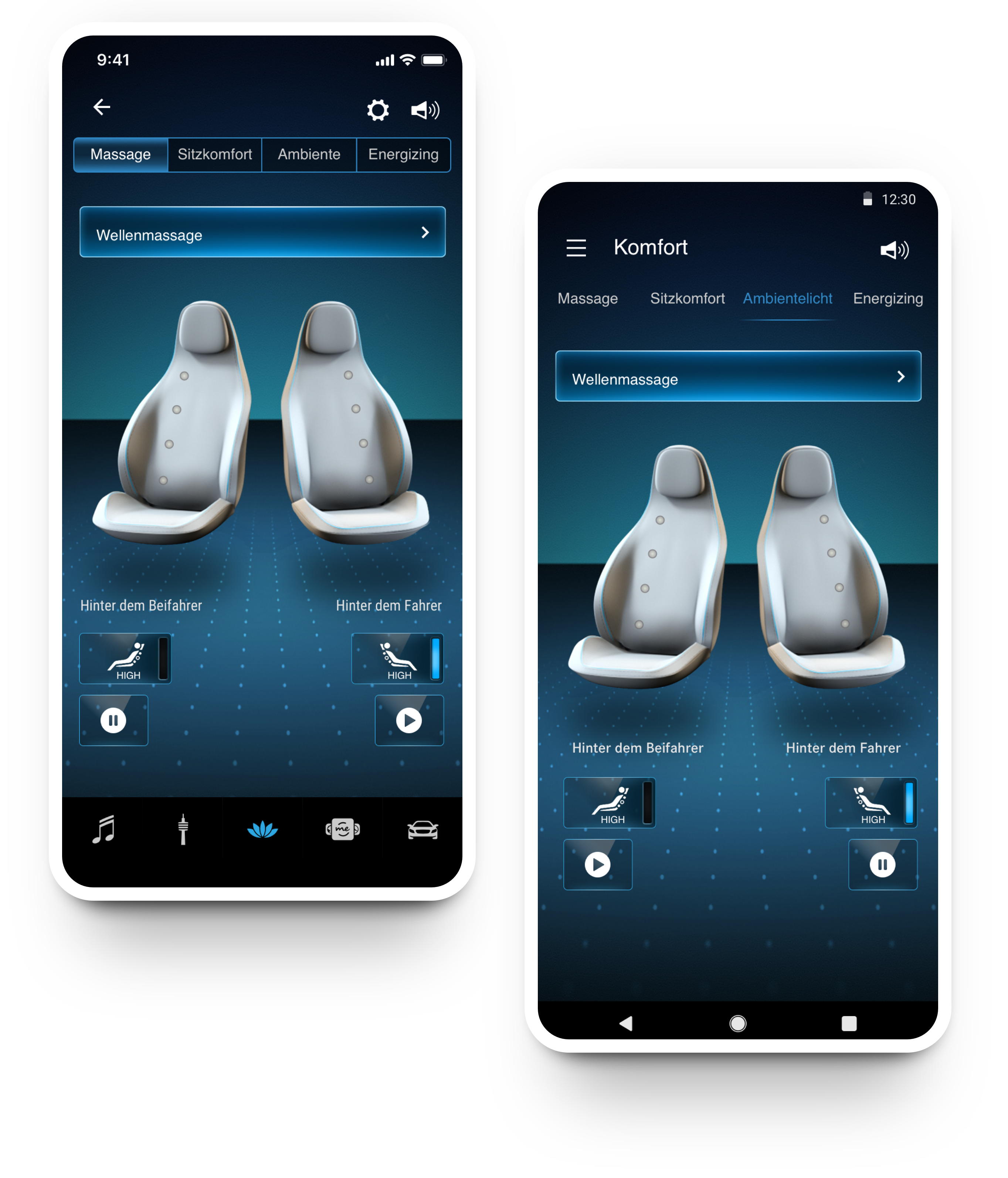
MBUX gives Mercedes-Benz drivers a rich, connected digital environment. But rear passengers, often in high-end models, lack the same level of control over comfort features: massage, ambient lighting, seat position, Energizing programmes.
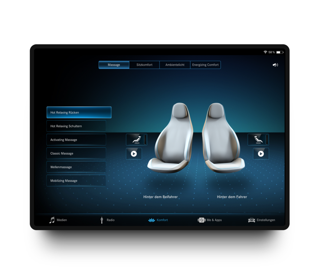
The project explored a mobile companion app that brings these controls to the passenger's own smartphone or tablet, as a natural extension of the MBUX system, without requiring them to lean forward or ask the driver.
Before designing, we needed to answer a fundamental question: should the app follow iOS and Android native design conventions, familiar and fast to learn, or adapt to the MBUX visual language for consistency with the in-car system?
We analysed 32 design elements across both approaches (Konsistenz vs Adaption) on iOS and Android, evaluating which delivered clearer, more usable interactions in the specific context of rear-seat vehicle use.
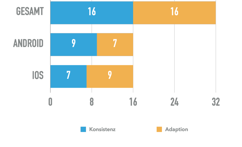
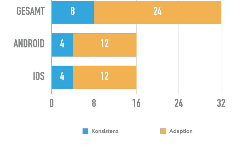
The research directly shaped the interface: MBUX-adapted on smartphone, balanced on tablet, visual coherence with the in-car system, intuitive to use from a rear seat.

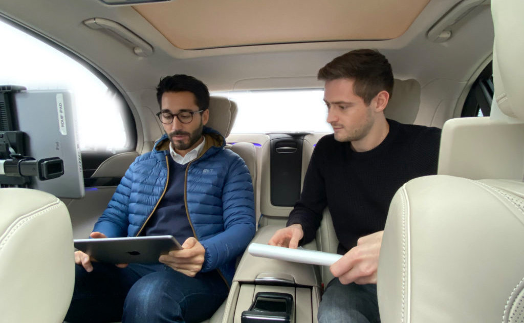
Tested in the actual car. Not just on a screen.
Testing happened in the actual vehicle, passengers seated in the rear, prototype on their own device, comfort features live. This surfaced real friction points: handling a phone while seated, glancing at controls without losing the ride experience, one-handed navigation.
The project delivered both a research framework (Konsistenz vs Adaption) and an actual app design, tested in the car, refined through iteration, coherent with the MBUX visual language on the platforms where it mattered most.
The same design pattern that feels natural on a smartphone can feel out of place on a car-mounted tablet. Screen size, posture, glare, one-hand use and the expectation of premium quality all shifted which conventions served users best. The Konsistenz vs Adaption study made that tangible and data-backed.
Testing in the real vehicle was the most valuable part of the process. Friction that didn't appear in usability labs showed up immediately in real seats, and fixing it led to a significantly simpler final design.
Let's turn your product challenge into something testable.